Speech Therapy PD
- EdTech / Healthcare
- Website Design
Overview:
Leatherback Printing is a locally-owned, woman-owned commercial printer based in Kirkland, WA, in business since 1966. They combine big-market capabilities — offset, digital, and large-format presses, CNC cutting, bindery, and fulfillment — with the flexibility of a local, family-run shop.
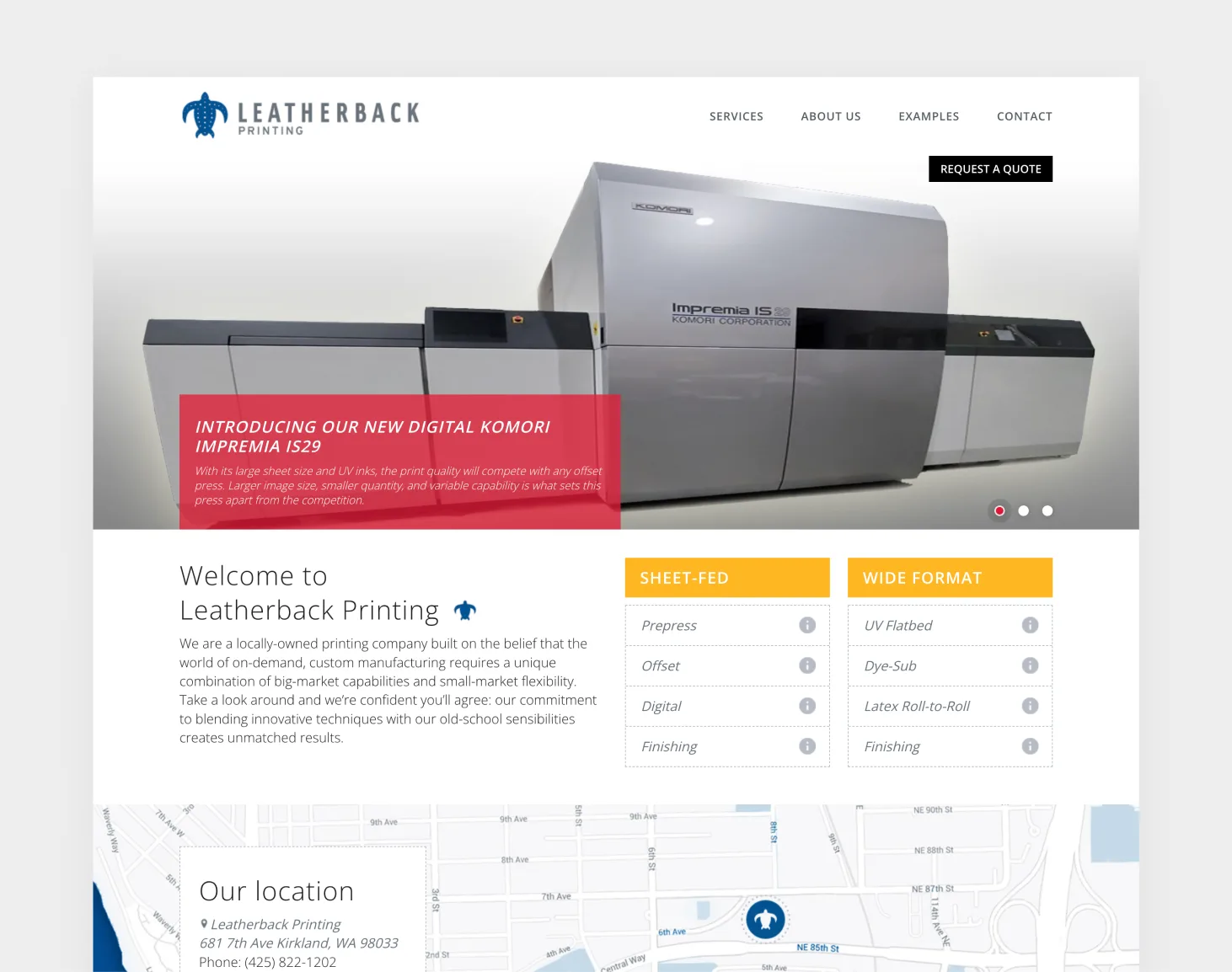
Leatherback had the equipment, the experience, and the client roster of a major commercial printer — but their digital presence read like a small local shop, which undersold them to exactly the agencies and national brands they wanted to win.
They also serve two very different audiences at once: direct brands looking for print, and trade partners looking for white-label production support. The challenge was making a 60-year-old, capability-heavy business feel modern and premium — without flattening the technical depth that sets it apart.
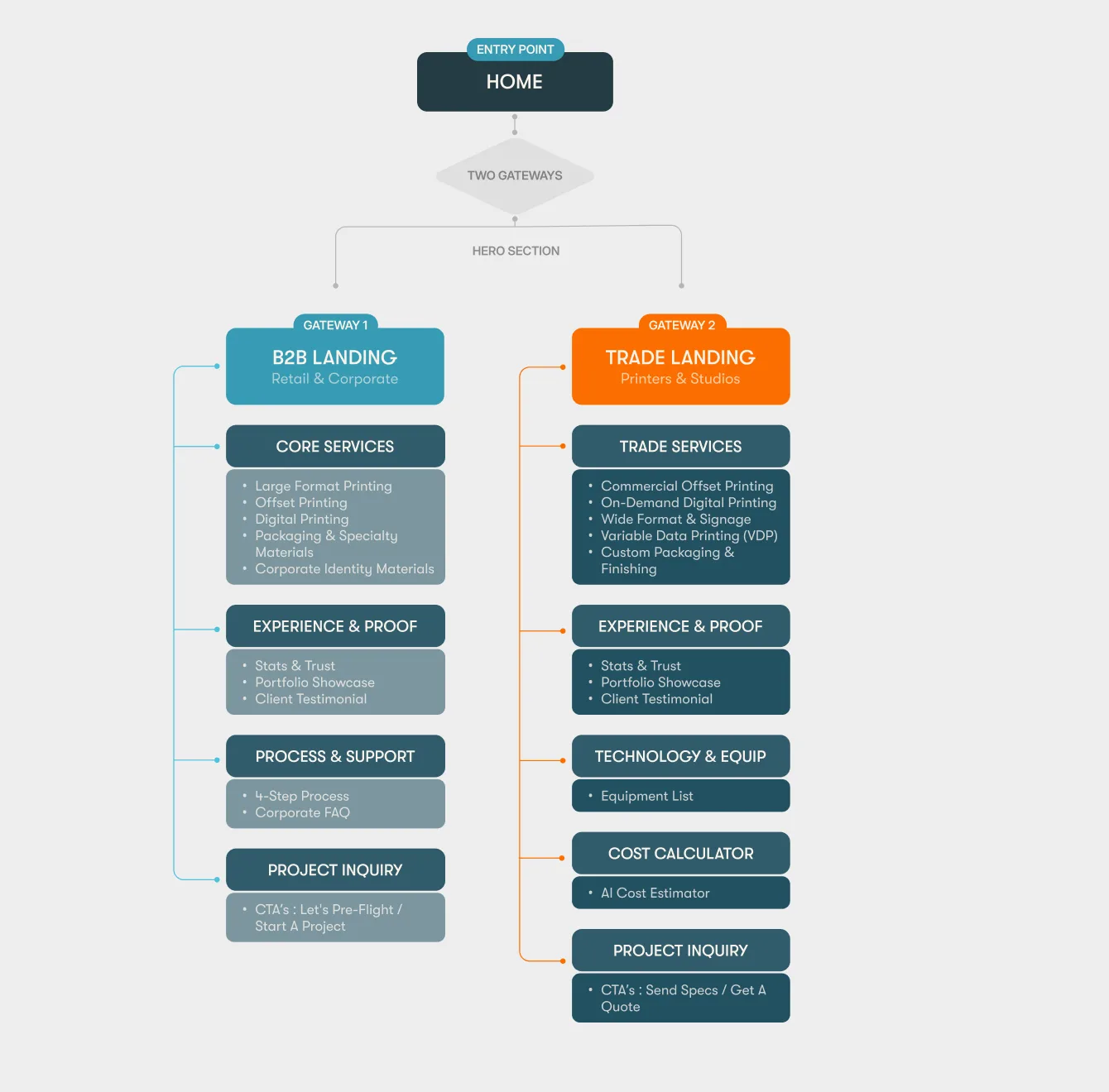
Two decisions shaped everything else.
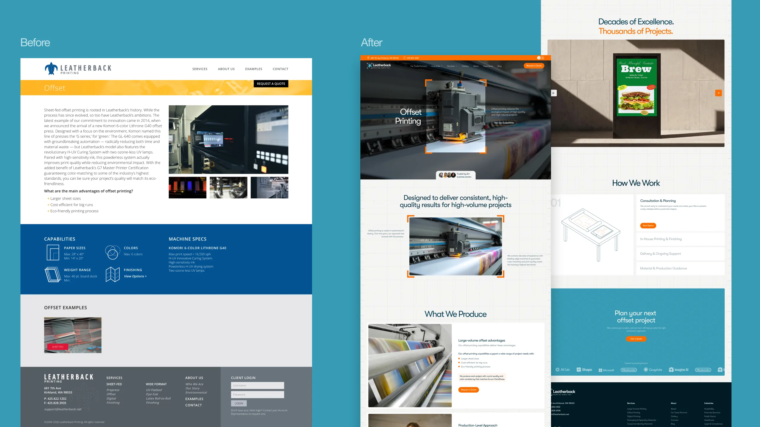
Positioning before pixels. The problem wasn't that the old site looked dated — it was that it described Leatherback at the wrong altitude. I led with their strongest claim (a high-end production partner built for scale) and structured every page to prove it, rather than starting from visual polish.
Two audiences, two paths. Direct brands and trade partners want completely different things — brands want to see outcomes, partners want capacity and reliability. Designing one undifferentiated funnel for both was the core UX risk. I split the journeys early so each audience hits its own route without the site feeling like two sites.
I mapped Leatherback's full range of capabilities into a structure that stays scannable as it scales, with dedicated routes for trade partners and industry-specific work. The quote request was the primary conversion goal, so I shortened the path to it and surfaced it from every capability page.
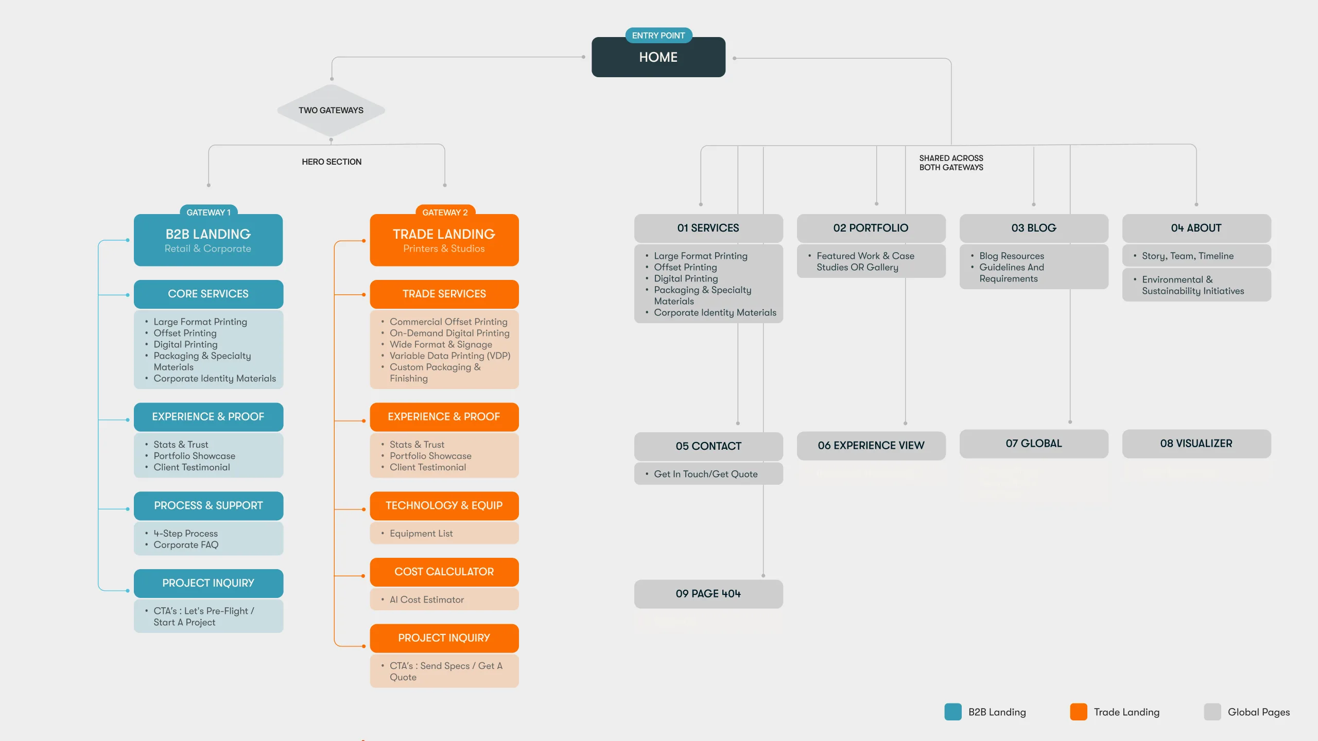
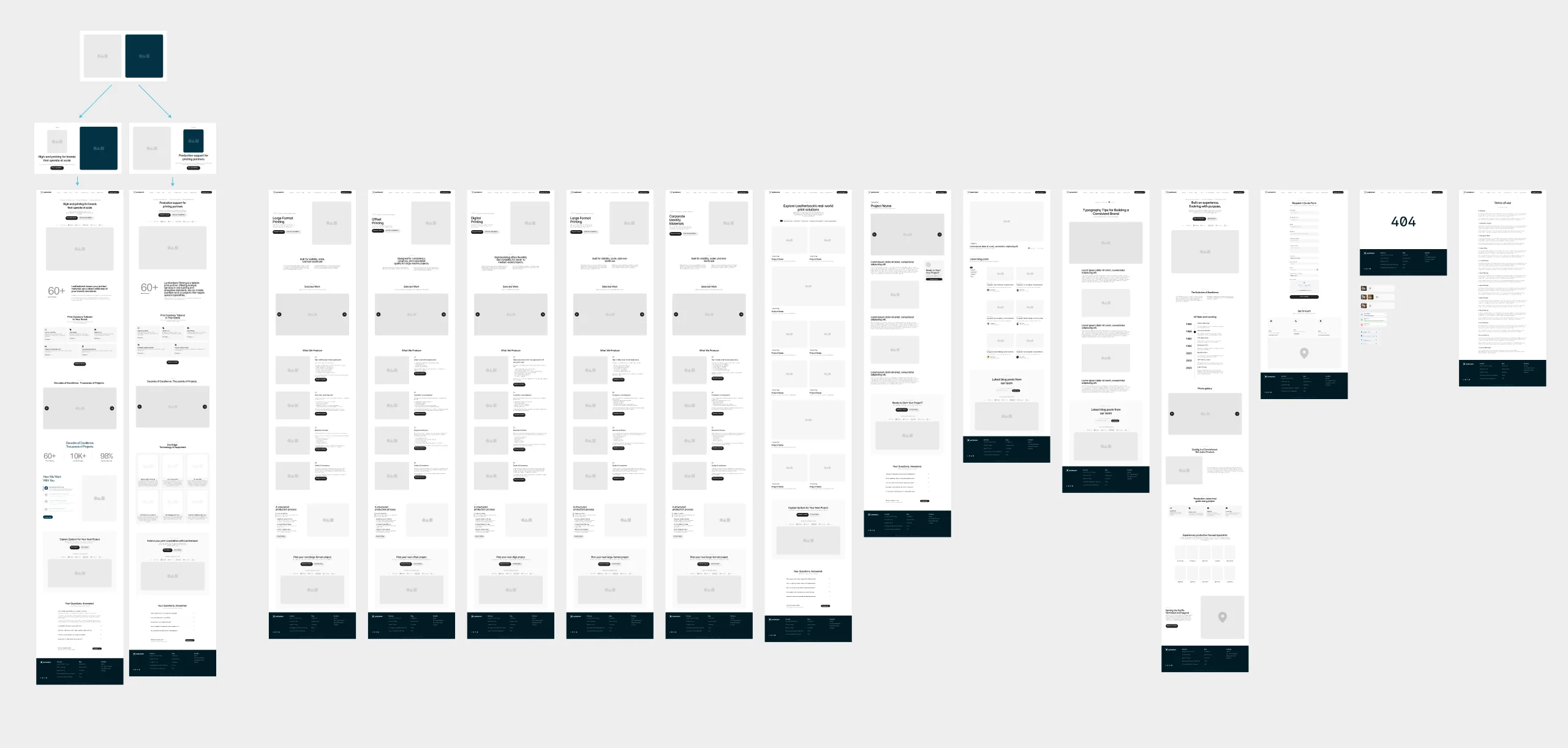
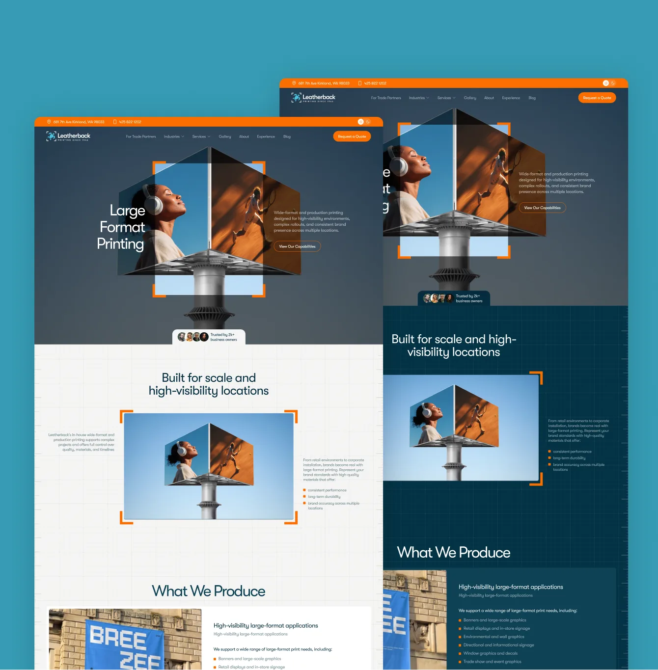
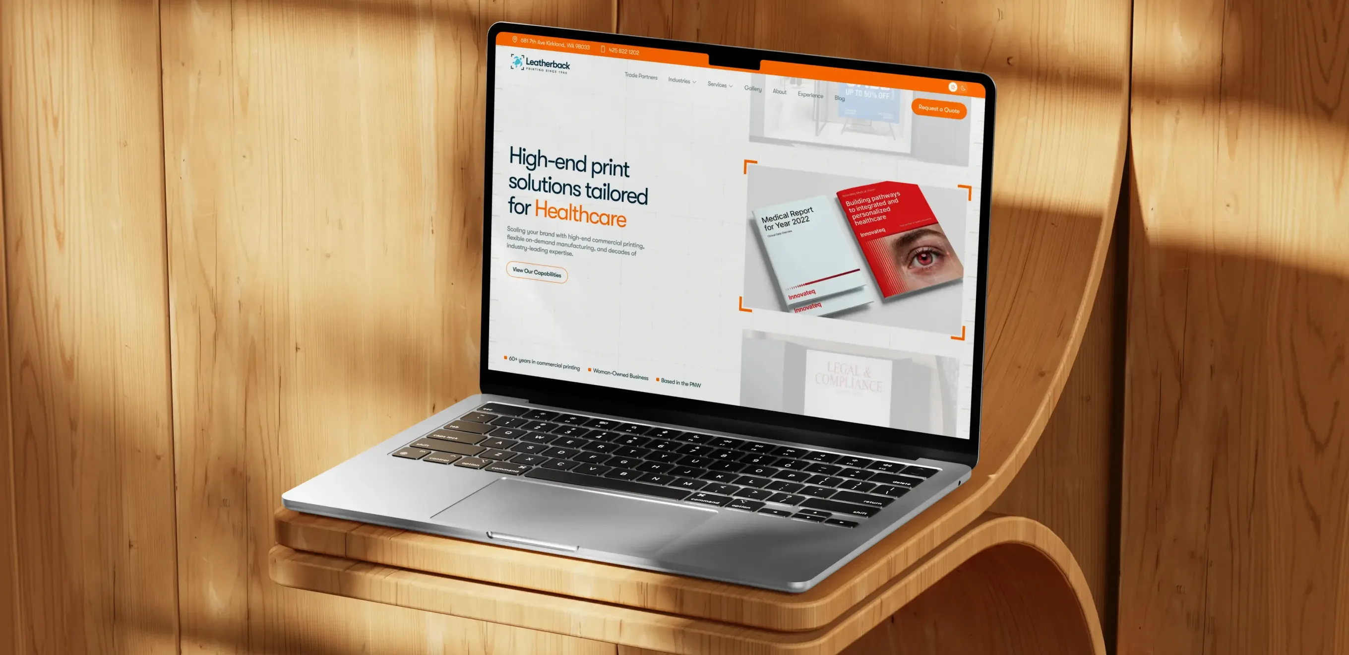
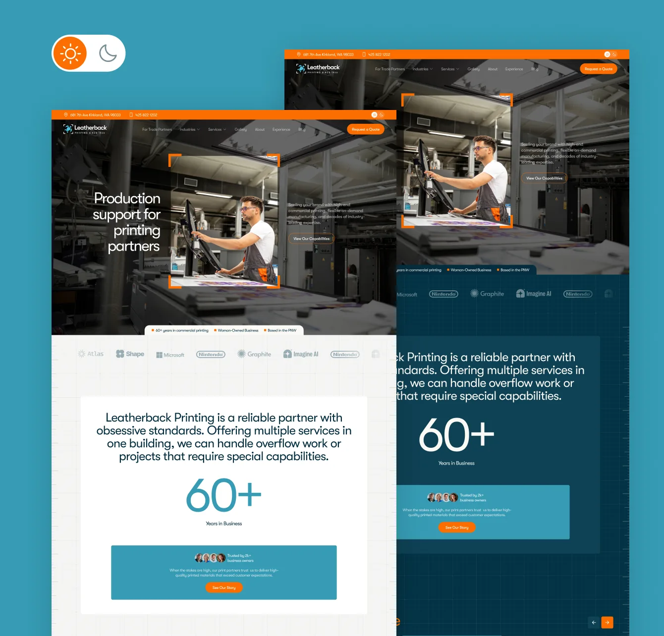
A fully responsive site that leads with positioning and routes each audience to its own path. Capability-heavy content — large-format, offset, digital, packaging, corporate identity — is organized into clear, scannable sections rather than one long list.
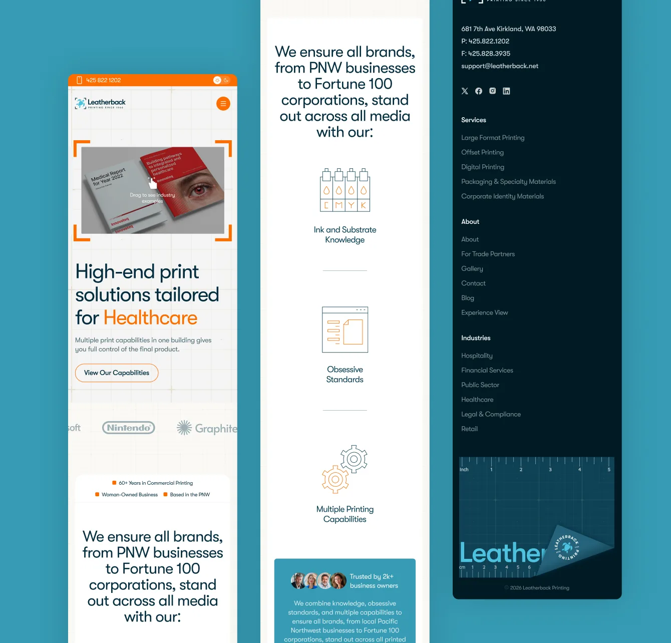
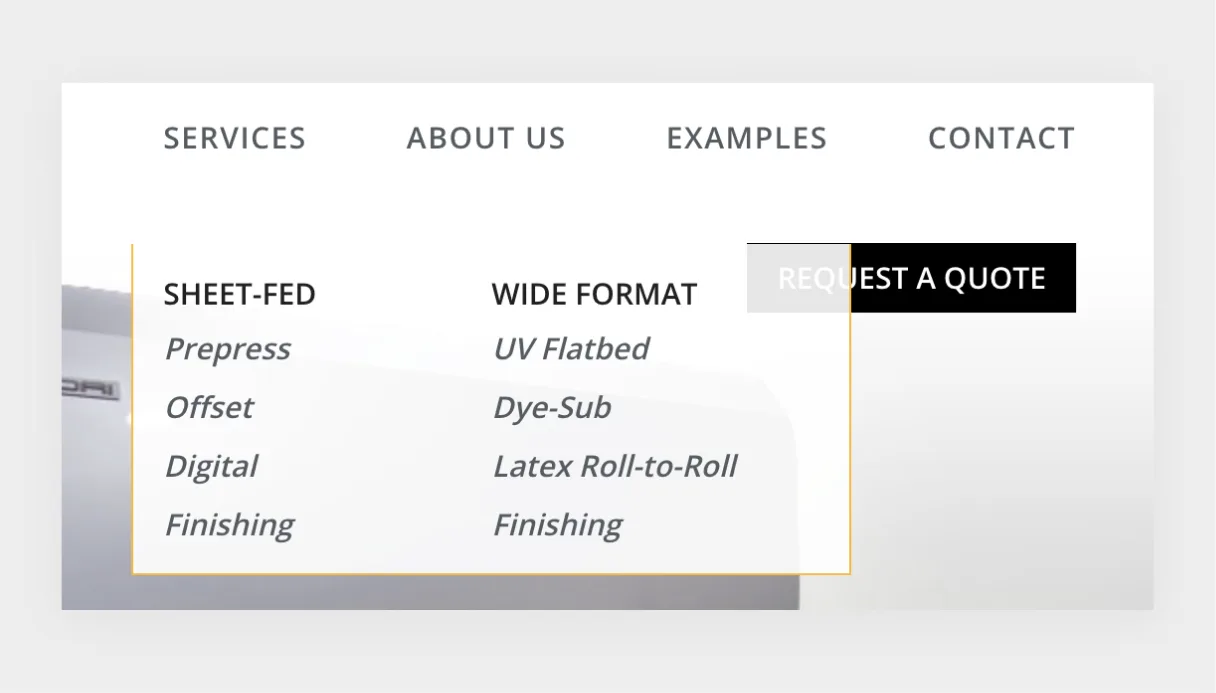
The old nav listed every service as a flat, undifferentiated list — fine for ten items, unreadable past thirty. I restructured it around the two audiences instead: a primary nav that leads with capability categories for direct brands, and a separate trade-partner entry point that surfaces pricing tiers and account tools those visitors actually need. A persistent "Get a Quote" action stays visible at every scroll depth, so the site's main conversion path never gets buried under browsing.
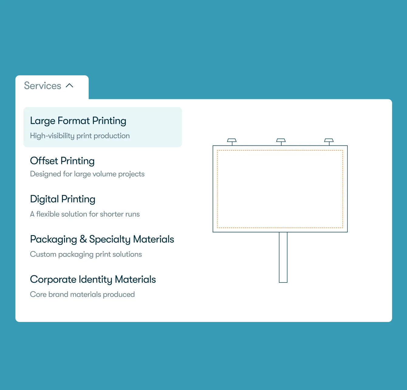
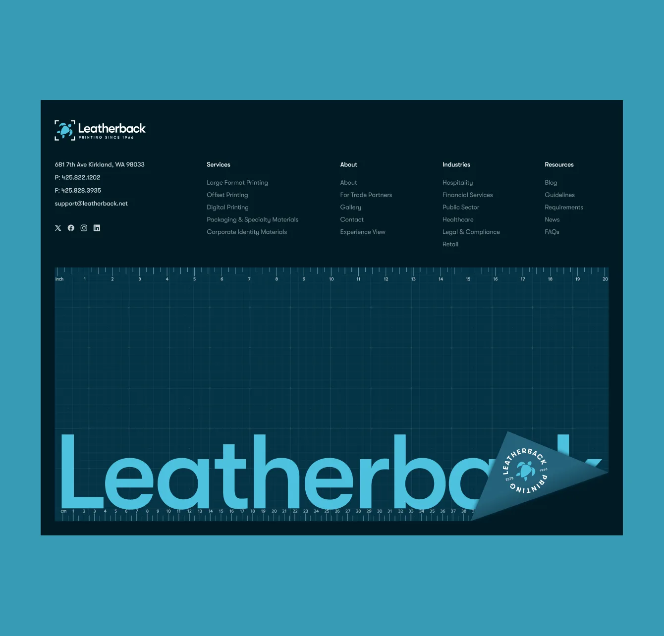
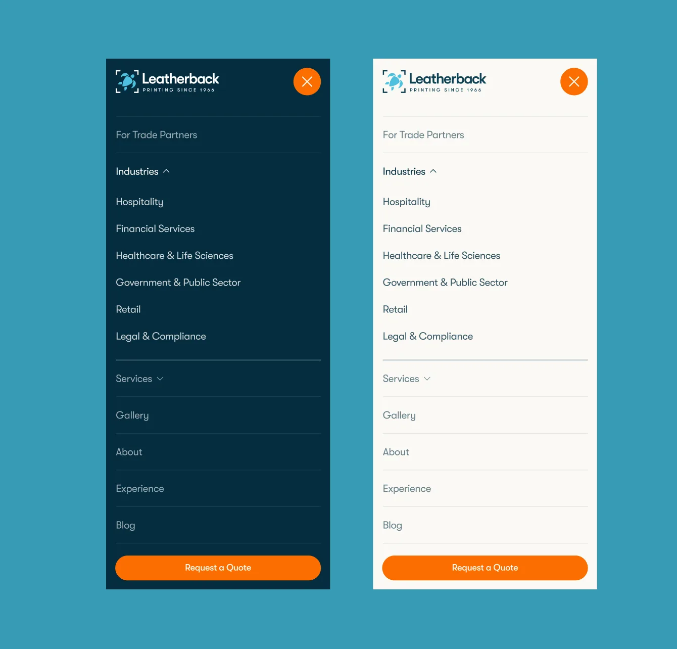
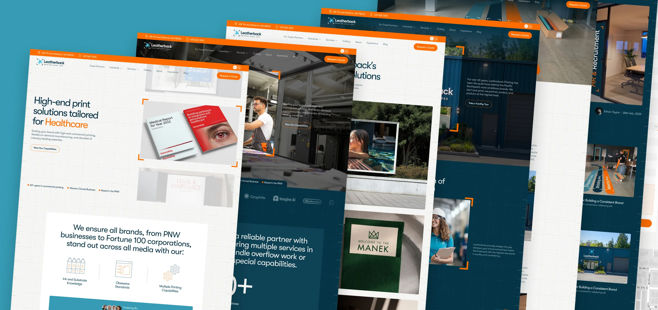
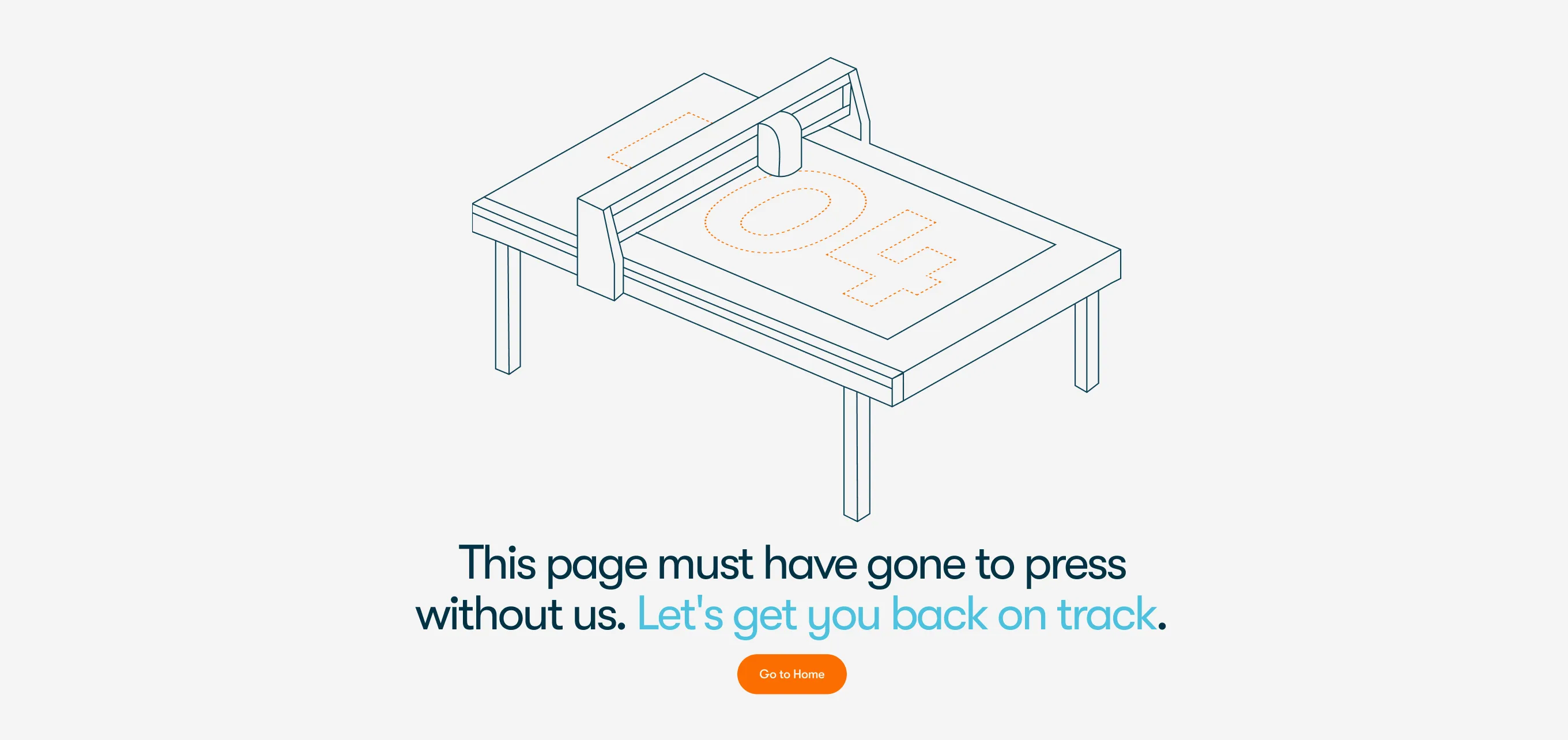
Illustration System
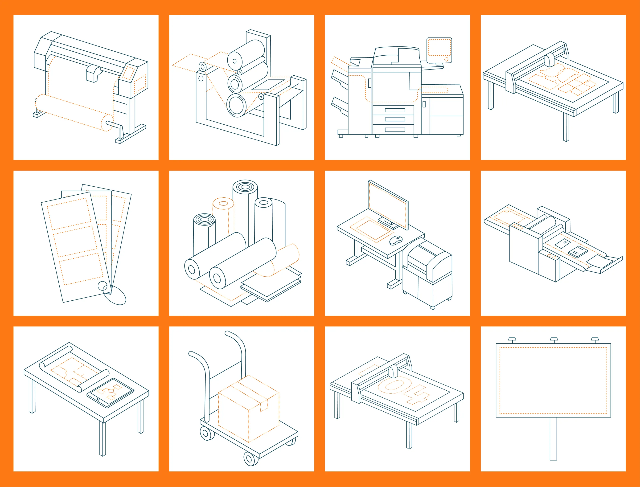
No stock. An ownable visual language instead. Generic stock photography reads as cheap for a deeply technical, equipment-driven business — the opposite of the goal. Instead, I built a custom set of isometric line illustrations of Leatherback's actual machinery and processes, on one consistent grid with a single accent color.
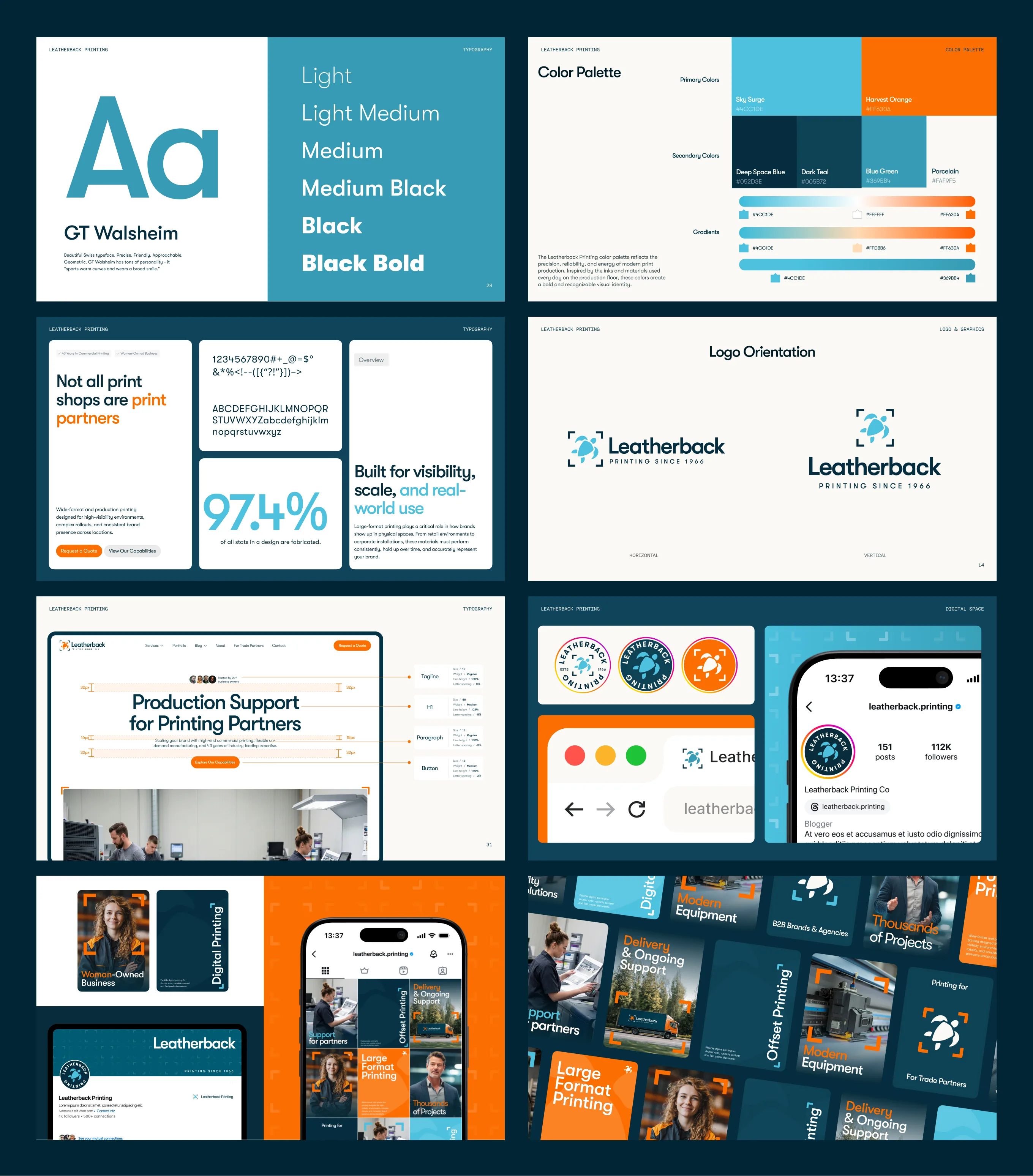
I built a brand system meant to make Leatherback feel premium and modern — and, just as importantly, easy for one person to maintain. Color and type are documented down to exact hex and RGB values, logo construction follows fixed orientation rules, and a full template library covers social, business cards, and internal tools. The result is a system Leatherback's own team can run consistently, without a designer in the loop for every new post or printed piece.
The site launched
Leatherback now has a system, not just a redesigned homepage: navigation and IA that scale past ten services without confusing two very different audiences, a brand identity documented well enough for a non-designer to extend it, and a custom illustration set that replaces stock photography across every touchpoint. Quote requests, time-on-site, and bounce data aren't in yet — once they are, this section gets real numbers instead of a description. For now, the honest measure of success is that Leatherback can grow its site and its collateral without needing a designer for every new page.