Leatherback Printing
- Print & Manufacturing
- Website Design
Overview:
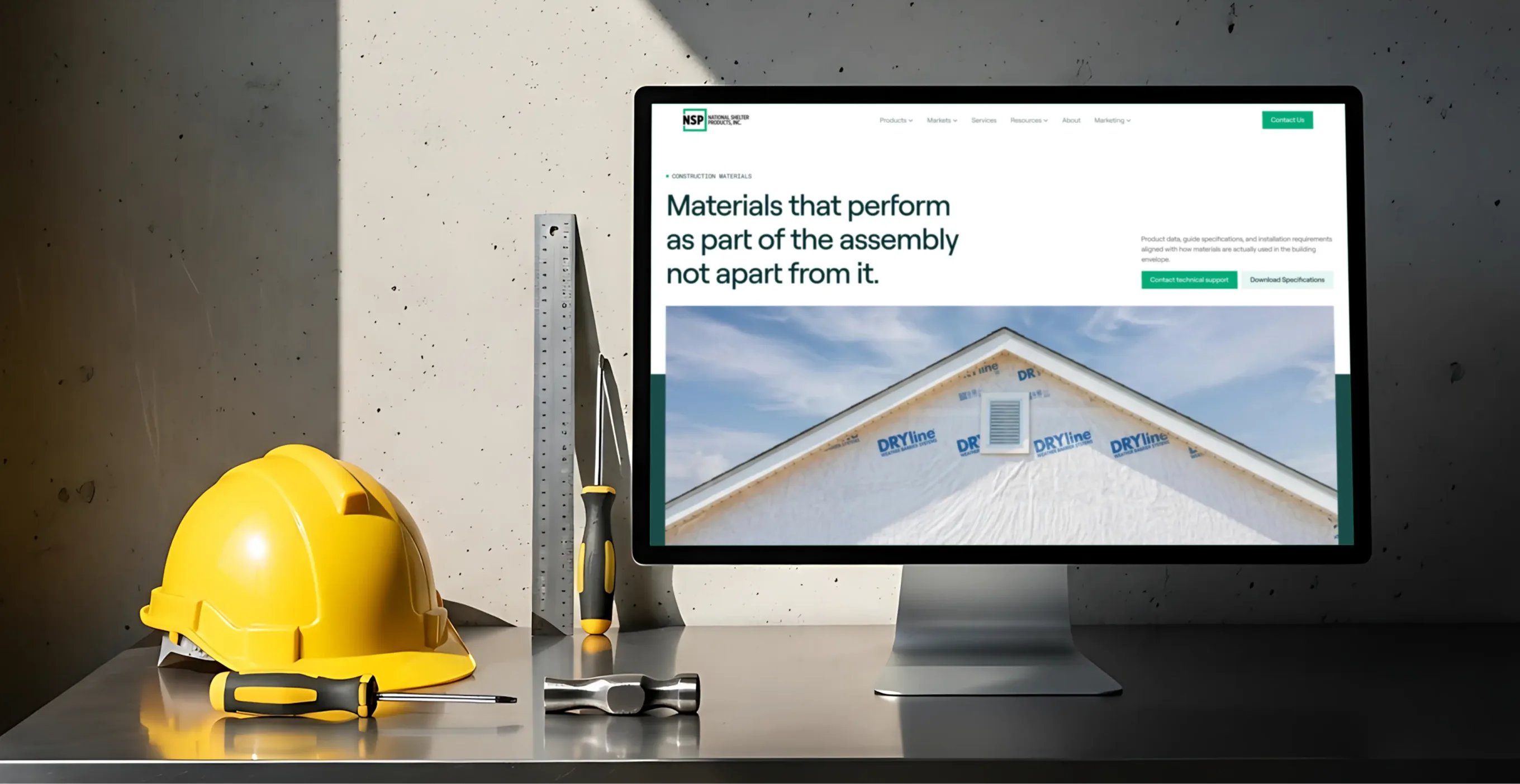
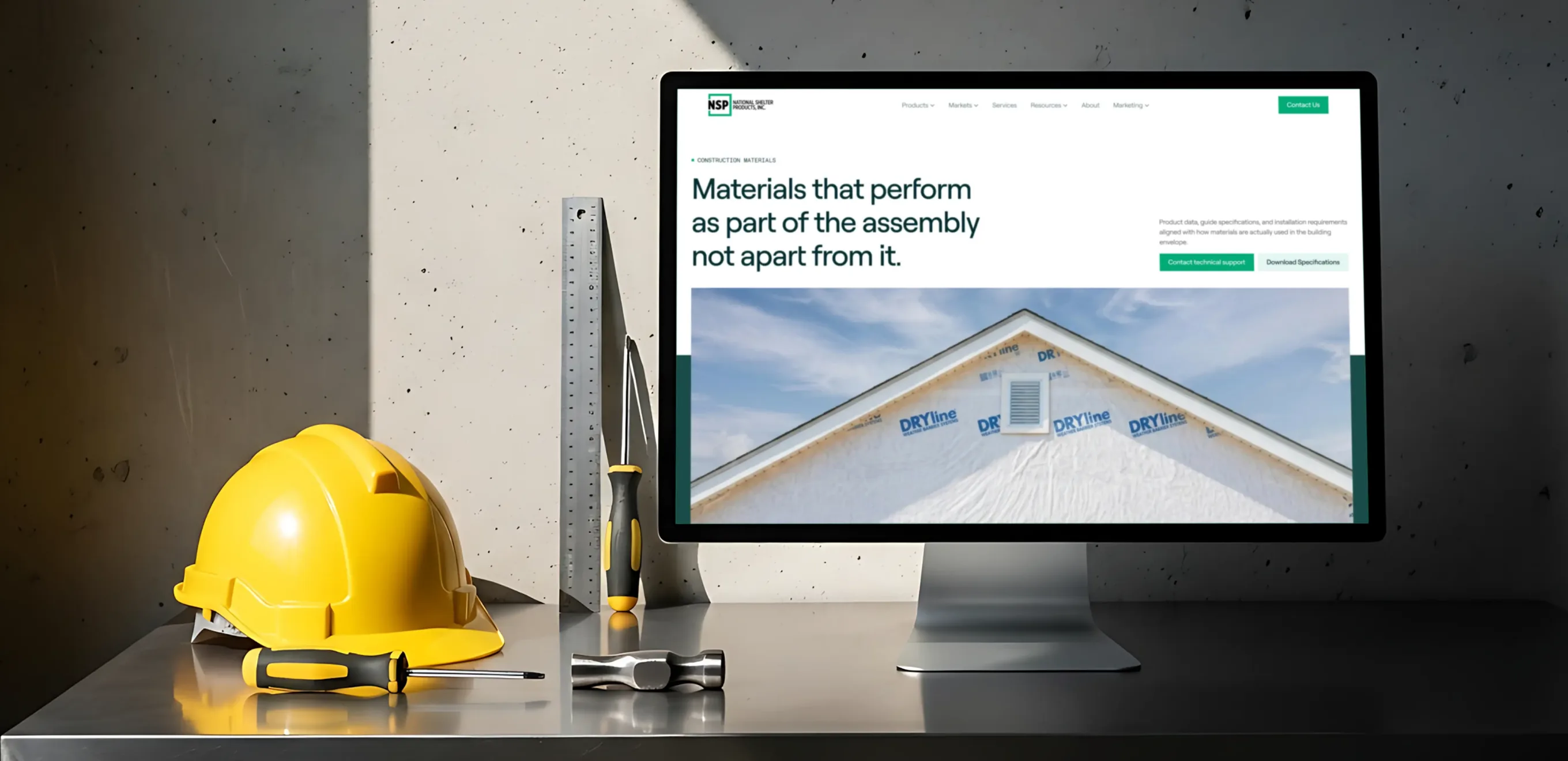
National Shelter Products (NSP) makes the building envelope systems that go behind the wall — weather barriers, structural sheathing, seam tape and flashing, and wallboard and flooring systems sold under the DRYline® name. The catalog spans three very different buyers — commercial and residential builders, manufactured housing plants, and RV manufacturers — each looking for a different kind of proof: performance data, code compliance, or installation detail. The previous site buried all three audiences under one flat product list with no way to filter by category, market, or document type.
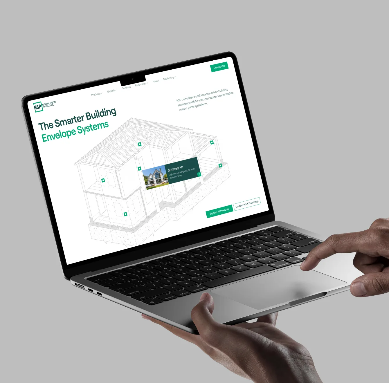
I worked as the sole UI/UX designer on this project, owning the site end-to-end: auditing the existing IA, redesigning navigation and the product taxonomy, rebuilding the resources and product page templates, and developing the illustration and badge system used across the site. I also refreshed the brand's visual language — typography, color, and icon style — without breaking from NSP's existing identity.
The Challenge
With SKUs spread across five product families and three separate market segments, NSP's site had outgrown its own navigation. Products, resources, and technical documentation lived in disconnected corners of the site with no shared structure — so a contractor looking for a warranty sheet, or a spec writer looking for CSI language, had to already know exactly where to look. Page layouts were inconsistent from one product to the next, and the resources library was a single unsorted list of 50+ documents with no filtering by product, market, or document type.
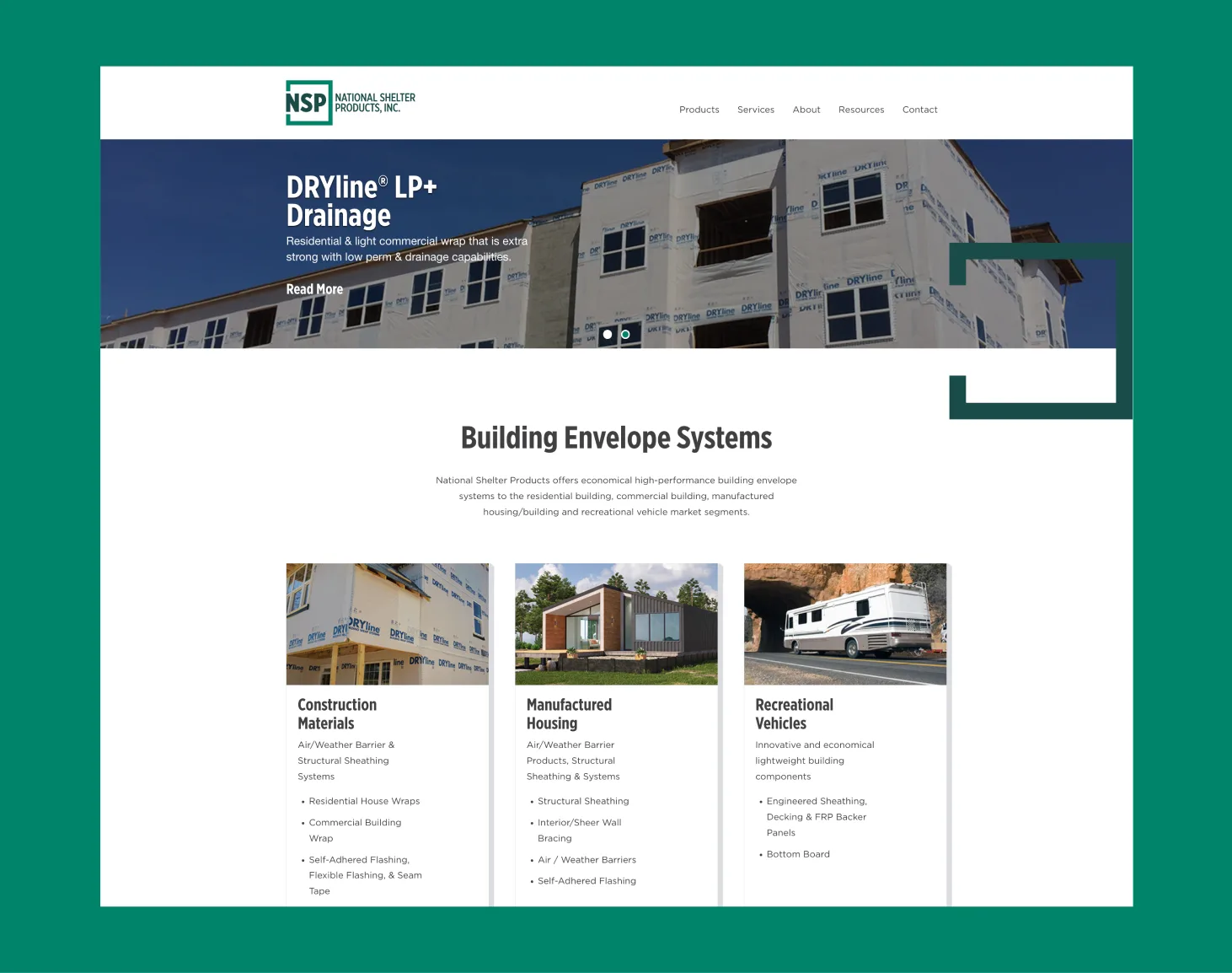
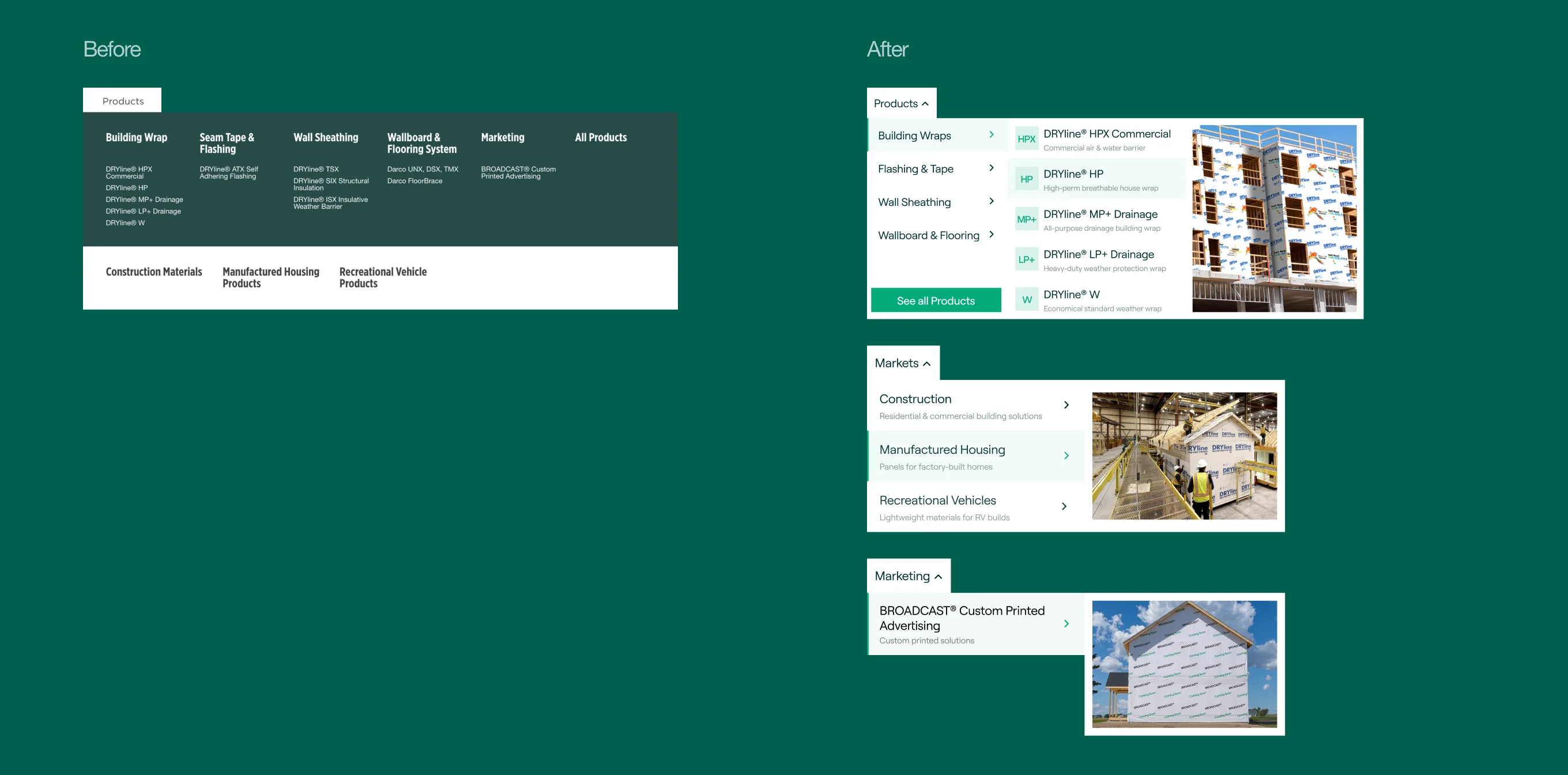
Left / Before:
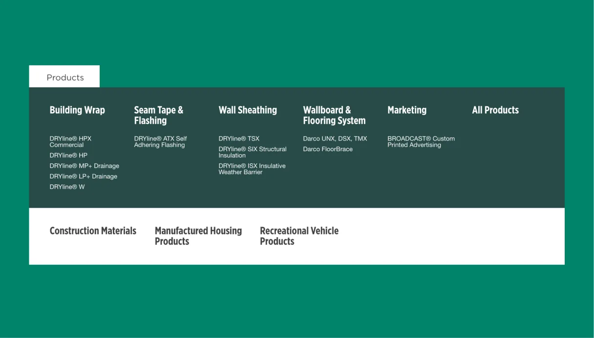
Everything lived under a single "Products" menu — six columns of
plain SKU names (DRYline® HPX Commercial, DRYline® MP+ Drainage…)
with no description or image telling you what any of them actually
did. Market segments were tacked on below as a separate,
disconnected list, so "browse by product" and "browse by market"
competed for the same dropdown.
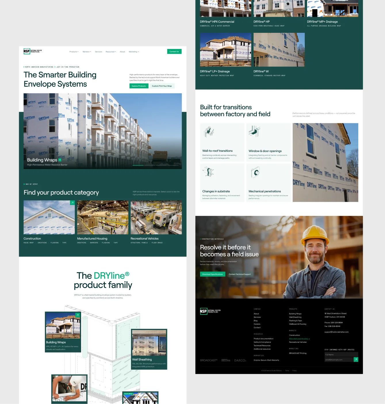
Right / After:
Split into three top-level menus — Products, Markets, and Marketing
— each built as a two-step mega-menu: pick a family or segment on
the left, see the specific items with a one-line description and
photo on the right. A builder can recognize DRYline® HPX Commercial
as "a commercial air & water barrier" before ever clicking into
it, and browsing by market no longer competes with browsing by
product.
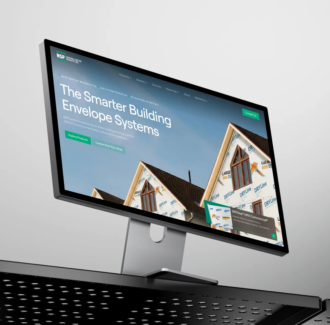
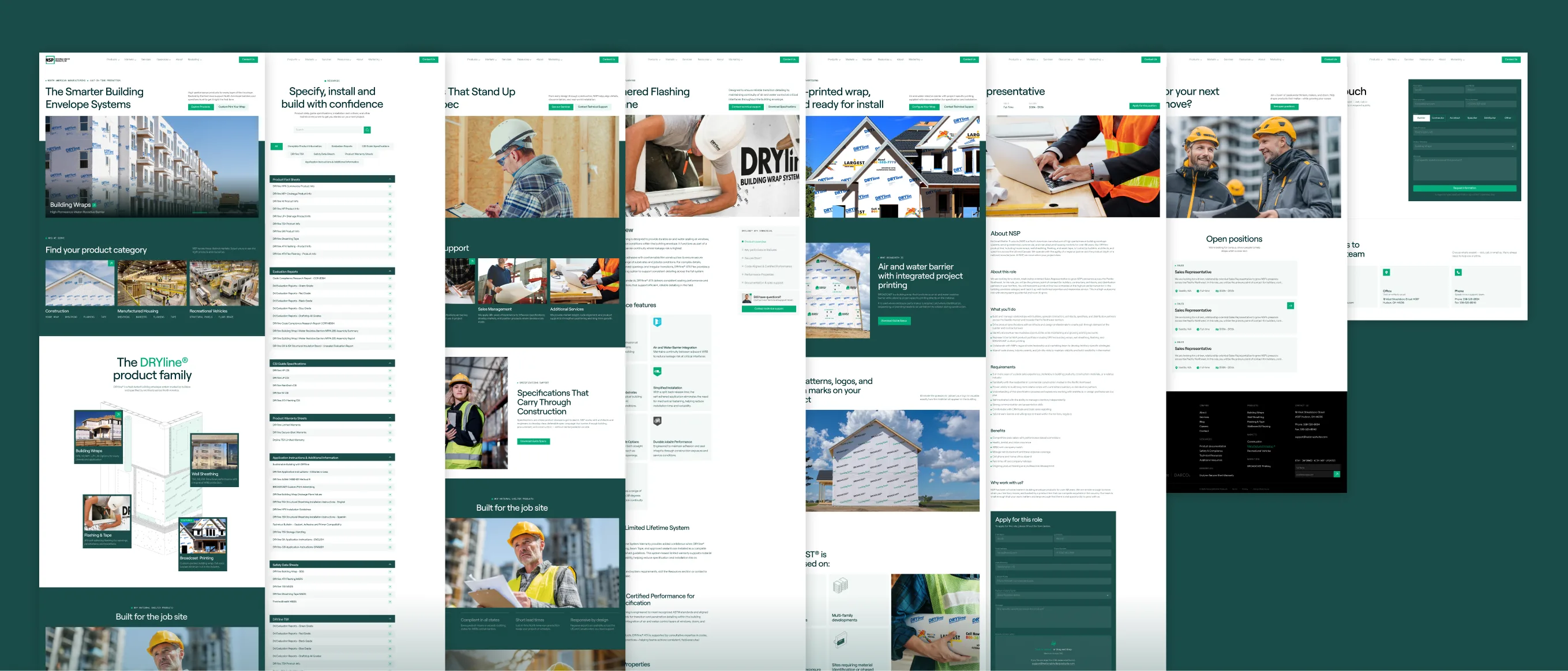
The redesigned site rebuilds NSP's site around three real audiences — builders, manufactured housing plants, and RV manufacturers — instead of one flat product list. Navigation, the resources hub, and individual product pages were all restructured to match how each audience actually searches, browses, and specifies. The sections below walk through each of those pieces in detail.
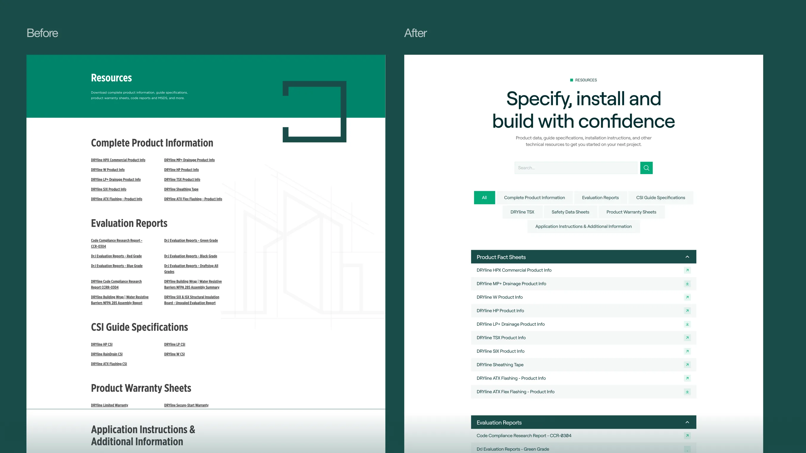
Left / Before:
The old resources page listed 50+ documents in flat, unsorted
categories — Product Info, Evaluation Reports, CSI Specs, Warranty
Sheets — with no search and no way to filter by product line.
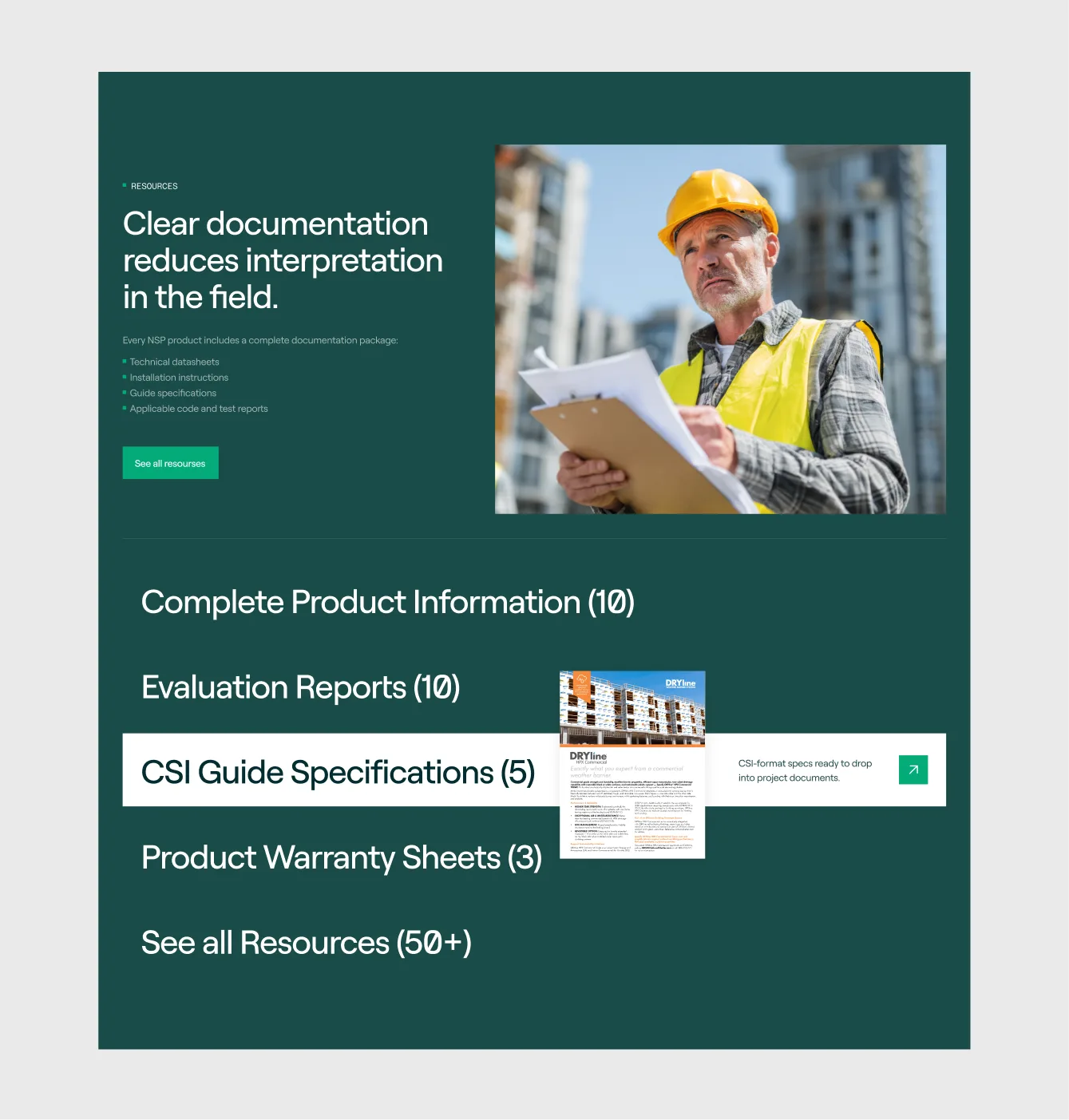
Right / After:
Rebuilt as a searchable, filterable hub organized by document type
and product family, so a spec writer can go straight to the CSI
language for one product without scrolling past everything else.
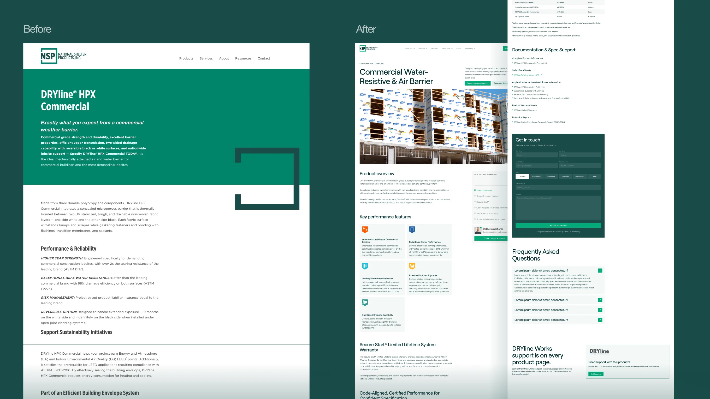
Left / Before:
Product pages were single long-scroll text blocks — performance
claims, sustainability notes, and technical detail all run together
with no clear hierarchy or way to jump to what mattered.
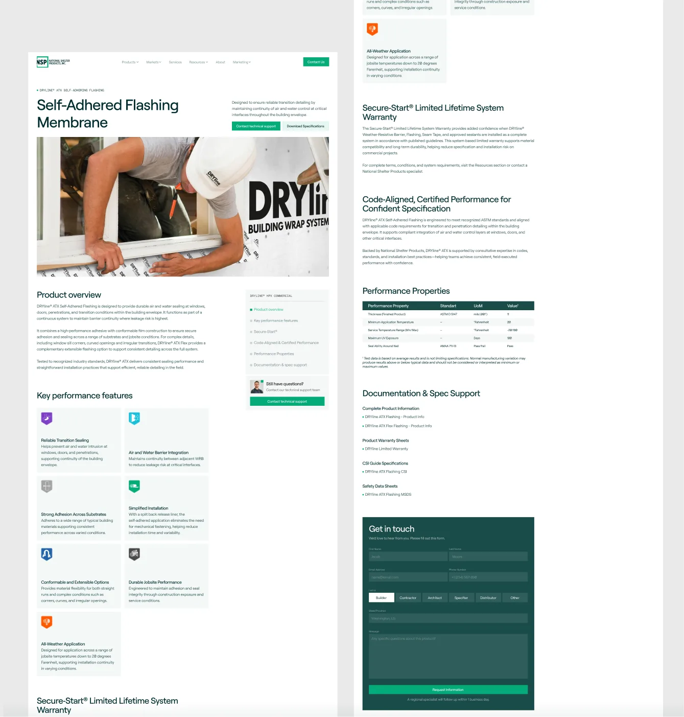
Right / After:
Redesigned around how the product is actually specified: overview,
key performance features, documentation and spec support, warranty,
and FAQ — each in its own scannable section, with direct links to
the exact data sheet or spec a builder needs.
Branding
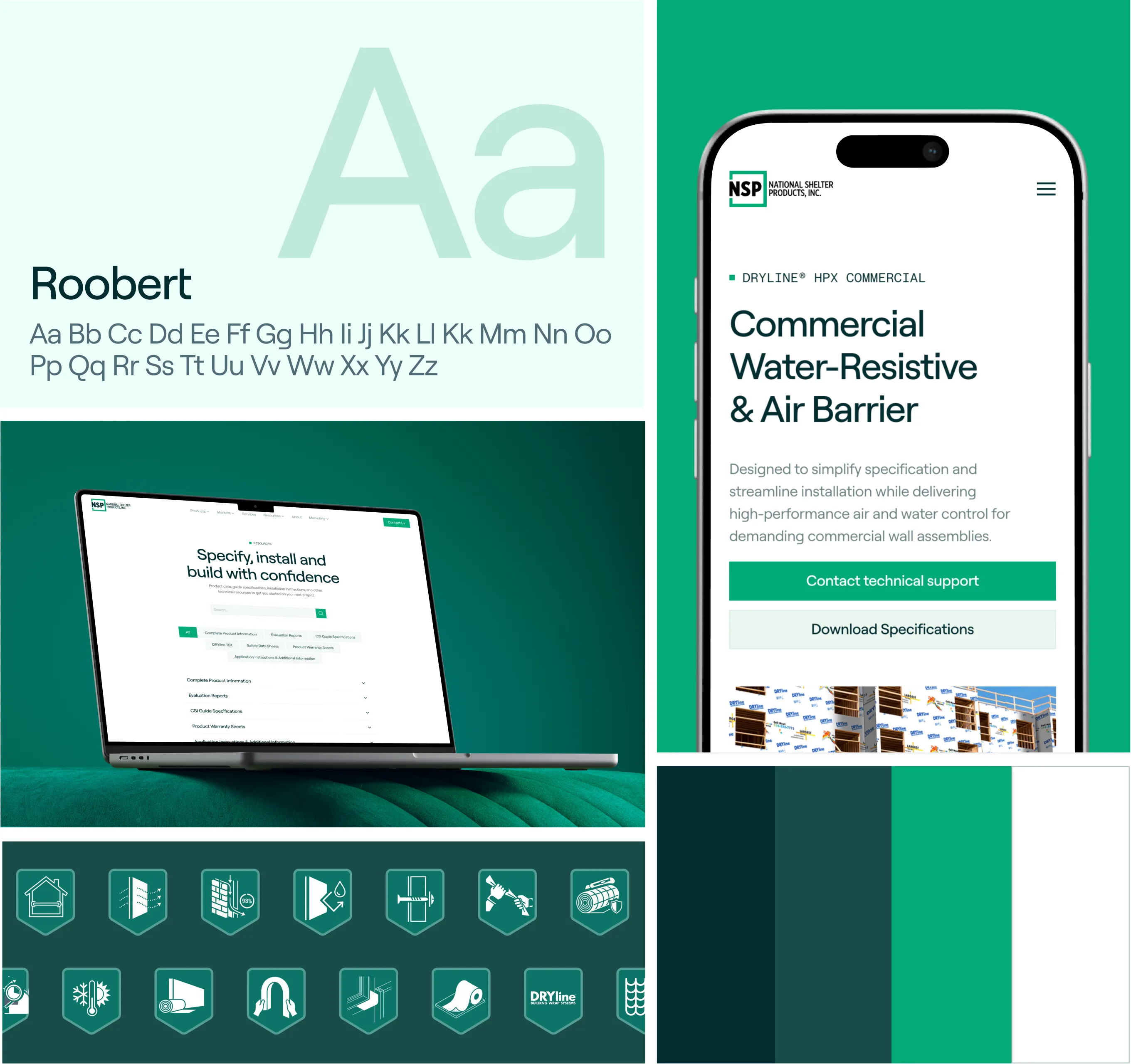
A light refresh, not a rebrand. I kept NSP's existing green and navy palette and DRYline product identity, but tightened the system: Roobert as the primary typeface for a cleaner, more technical feel, a simplified color scale for UI use, and a consistent icon set that carries through navigation, resource cards, and product pages.
Illustrations
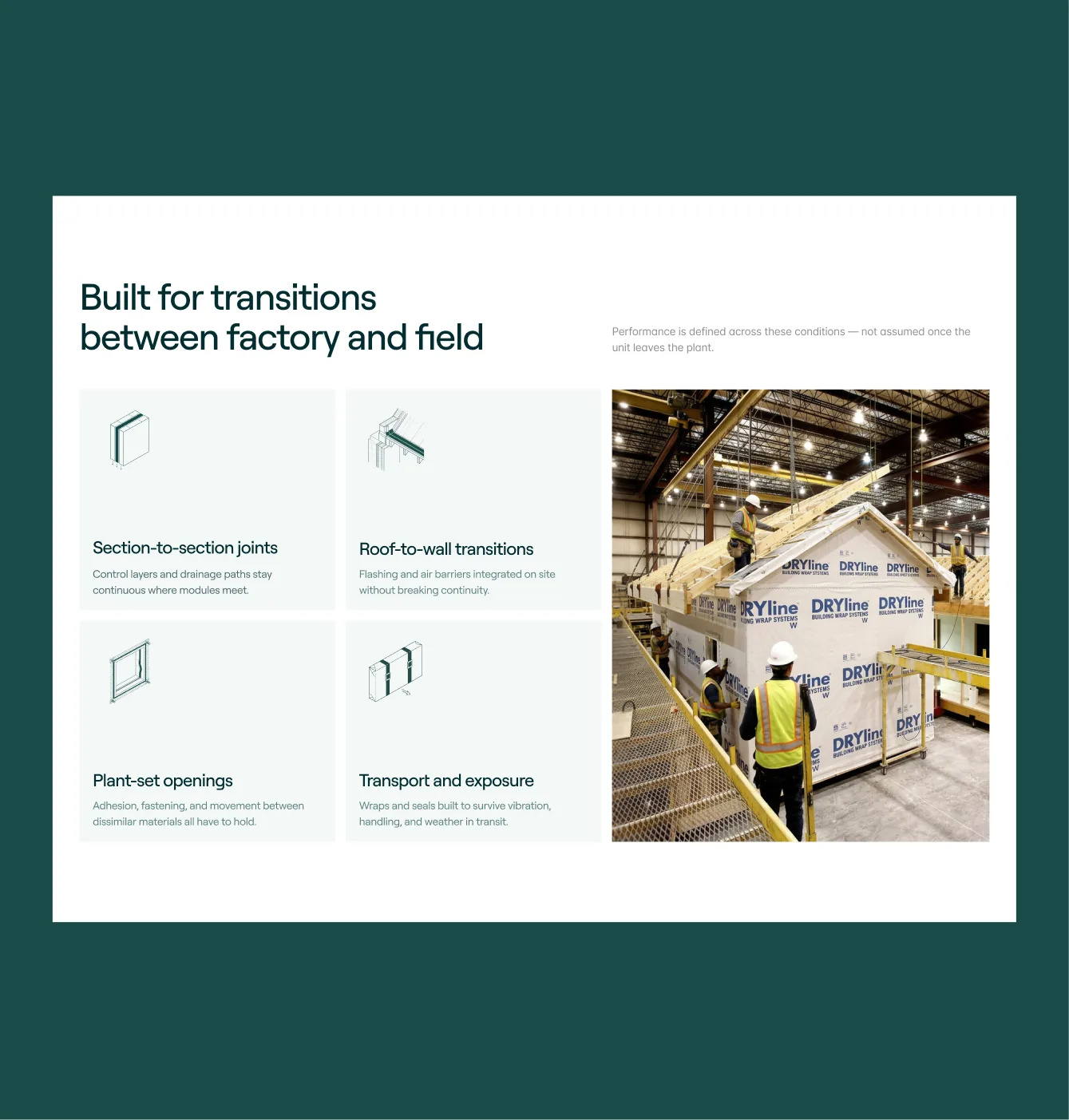
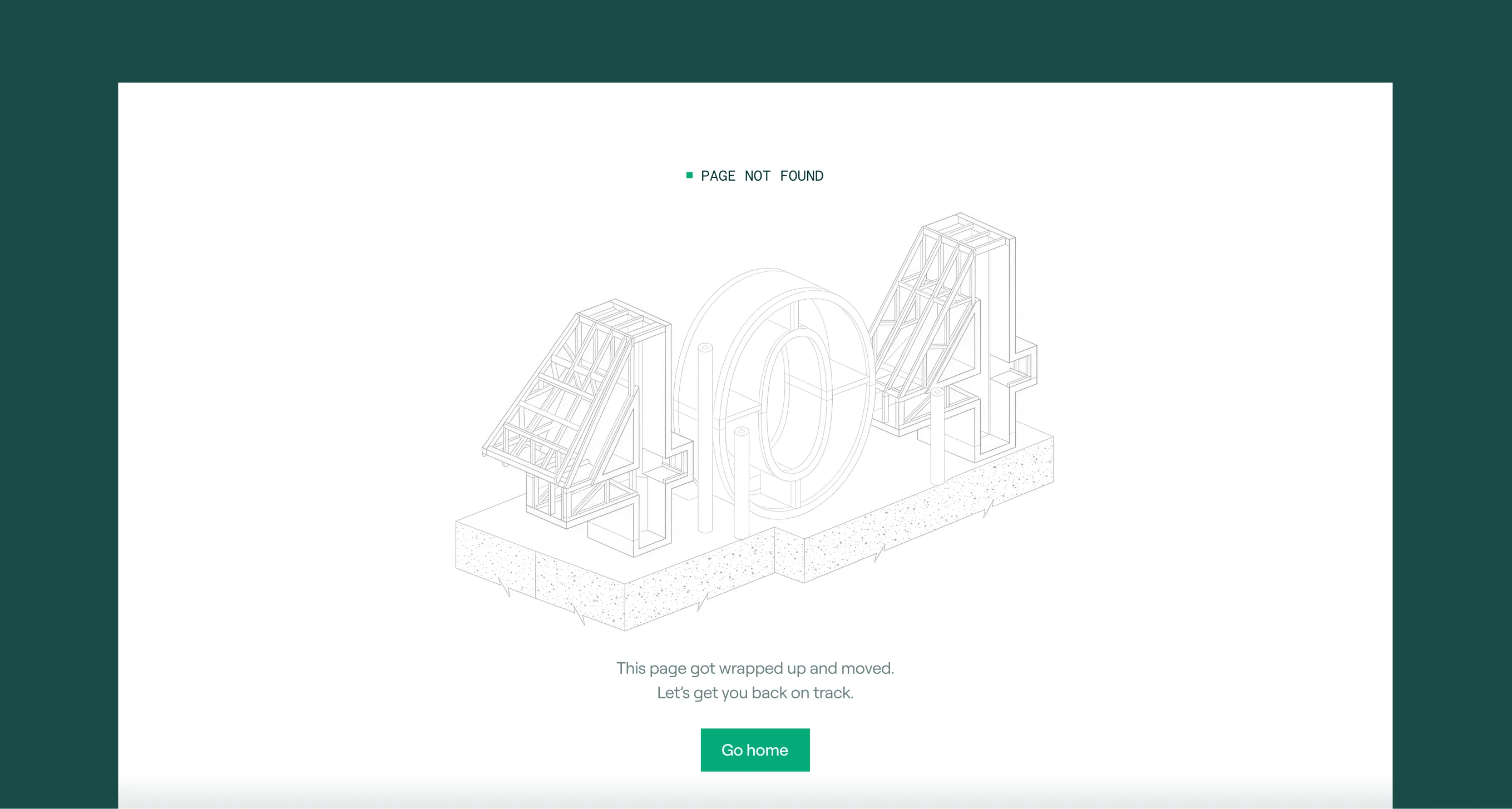
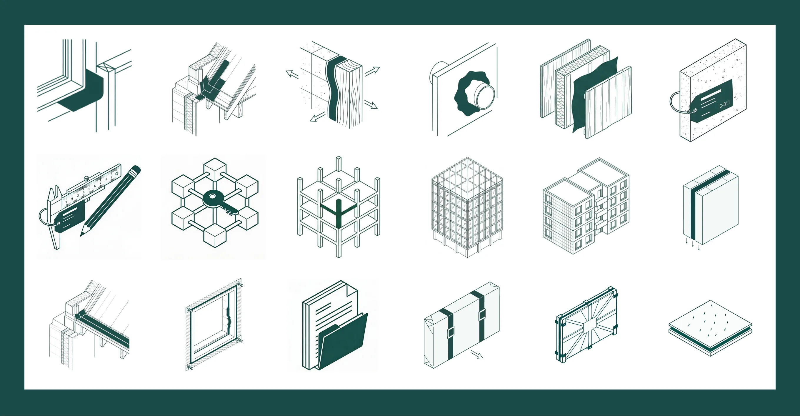
To explain building science without relying on stock photography, I designed a custom set of isometric line illustrations — wall assemblies, transitions, fasteners, and testing details — plus a badge system used throughout the site to flag performance properties, certifications, and product categories at a glance.

The site launched
The redesigned site replaced a decade-old information architecture with one built around how NSP's three markets actually shop and specify — giving the resources and product pages room to grow as the catalog does.